From the court to the screen: how to design a graphic identity for a sports tournament
A sports tournament’s graphic package is the visual language of the production. When it’s well designed, it reinforces the event’s brand and makes everything look like an integral production. When it’s poorly designed, each graphic looks like a loose element with no relation to the others.
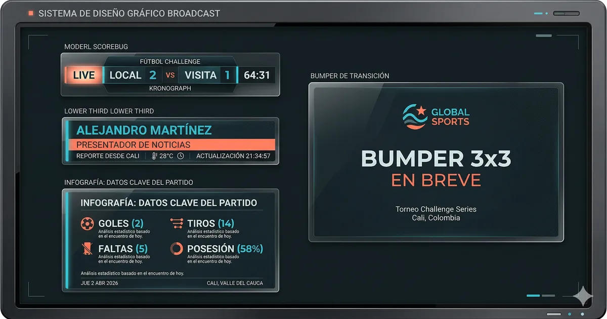
The three pillars of broadcast design
Legibility above all: Broadcast graphics are viewed on screens of every size. Text must be legible at all of them. Condensed bold fonts, generous sizes, high contrast between text and background.
Visual consistency: All elements of the package must look like they belong to the same family. Same colors, same fonts, same composition logic.
Function first, aesthetics second: A beautiful graphic that takes a second to read is a failed graphic. The viewer has between two and five seconds to process the information in a lower third.
The color system
The most common mistake is using team colors as the design base. The correct solution: use the event or competition colors as a neutral base, and team colors as accents.
Typography for broadcast
Fonts that work in broadcast are condensed (take up less horizontal width), bold or extrabold (readable from a distance). Families that work well: Barlow Condensed, Bebas Neue, Oswald, Teko, Saira Condensed. Never use serif fonts in broadcast.
Animations: entry and exit
Recommended timing: entries between 300 and 500 ms. Exits between 300 and 400 ms. Animations that work: slide from below or from the left, fade in, subtle scale in. Avoid: rotations, particle effects, extreme zoom.
TV vs. streaming vs. jumbotron: three contexts, one system
For jumbotron, text must be even larger and contrast higher. Ideally, the graphics system generates a jumbotron-specific version with size and contrast adjustments applied automatically.
The design process
- Define the competition’s color palette
- Select the main typeface family
- Design the scorebug — it’s the most complex element
- Derive the system toward other elements (lower thirds, fullscreens)
- Design bumpers as visual transitions
- Test everything together, in motion, over real video signal